

MediLinker
MediLinker
Through research and iteration, MediLinker is designed as an electronic health identity management system that enables patients to manage their health records, medication and insurance information. Developed and designed by Dell Medical School and UT iSchool students.
Through research and iteration, MediLinker is designed as an electronic health identity management system that enables patients to manage their health records, medication and insurance information. Developed and designed by Dell Medical School and UT iSchool students.
Project Context
Timeline: Aug - Dec 2021
Team: Stephanie Cyrill, Ashwini Paradkar, Shruti Hanchinal
Responsibilities
UX Researcher
User Research: Competitive Analysis, Heuristic Evaluation, User Interviews
Tools
Figma
Sketch
Project Context
Timeline: Aug - Dec 2021
Team: Stephanie Cyrill, Ashwini Paradkar, Shruti Hanchinal
Timeline: Aug - Dec 2021
Team: Stephanie Cyrill, Ashwini Paradkar, Shruti Hanchinal
Timeline: Aug - Dec 2021
Team: Stephanie Cyrill, Ashwini Paradkar, Shruti Hanchinal
Responsibilities
UX Researcher
User Research: Competitive Analysis, Heuristic Evaluation, User Interviews
UX Researcher
User Research: Competitive Analysis, Heuristic Evaluation, User Interviews
Tools
Figma
Sketch
Figma
Sketch
Figma
Sketch
How this project came up
Information fragmentation in healthcare is one of the leading underlying causes for problems such as misdiagnoses, data loss, incorrect medications, legal issues and fraud [1]. The problems also escalate when patients do not have control over their own personal health information. In 2020, the US Department of Health and Human Services (HHS) established rules that would provide patients safe, secure access to their health data while letting them opt to share to big tech or other [2, 3].
Introducing MediLinker
Ideated by Dell Medical School, MediLinker is a digital health wallet that enables patients to manage health records, medication and insurance through blockchain.
Introducing MediLinker
Ideated by Dell Medical School, MediLinker is a digital health wallet that enables patients to manage health records, medication and insurance through blockchain.
Introducing MediLinker
Ideated by Dell Medical School, MediLinker is a digital health wallet that enables patients to manage health records, medication and insurance through blockchain.
Introducing MediLinker
Ideated by Dell Medical School, MediLinker is a digital health wallet that enables patients to manage health records, medication and insurance through blockchain.
Goal
The client, Dell Medical School was interested in:
understanding how their app fits in with the competitor space
understanding if it provides value to their customers
exploring design improvements to better assist potential users
Goal
The client, Dell Medical School was interested in:
understanding how their app fits in with the competitor space
understanding if it provides value to their customers
exploring design improvements to better assist potential users
Goal
The client, Dell Medical School was interested in:
understanding how their app fits in with the competitor space
understanding if it provides value to their customers
exploring design improvements to better assist potential users
Goal
The client, Dell Medical School was interested in:
understanding how their app fits in with the competitor space
understanding if it provides value to their customers
exploring design improvements to better assist potential users
Team Focus
Since the app deals with 2 fields: health information - which needs to handled carefully and, blockchain which is a relatively new concept (especially in the healthcare field), this intersection needs to be approached properly such that we can establish
User comfort in using the app: We need to ensure comfort using blockchain and digitizing health information
User trust in the app: To do this, we need to prioritize security, transparency and privacy
User support while using the app: We need to provide better onboarding, tutorials and accessible help to ensure a better user experience.
The problem space
To understand the overall space of MediLinker, we needed to first understand MediLinker, while also considering what their competitors are doing.
The problem space
To understand the overall space of MediLinker, we needed to first understand MediLinker, while also considering what their competitors are doing.
The problem space
To understand the overall space of MediLinker, we needed to first understand MediLinker, while also considering what their competitors are doing.
The problem space
To understand the overall space of MediLinker, we needed to first understand MediLinker, while also considering what their competitors are doing.
Understanding MediLinker
In order to get a deeper grounding of MediLinker's space, we needed to
Understand the problems MediLinker is trying to solve
Understand the problems that users are currently facing
Understand how they currently approach these problems
Through affinity mapping & thematic analysis, we were able to get a better understanding of MediLinker.
Understanding the market
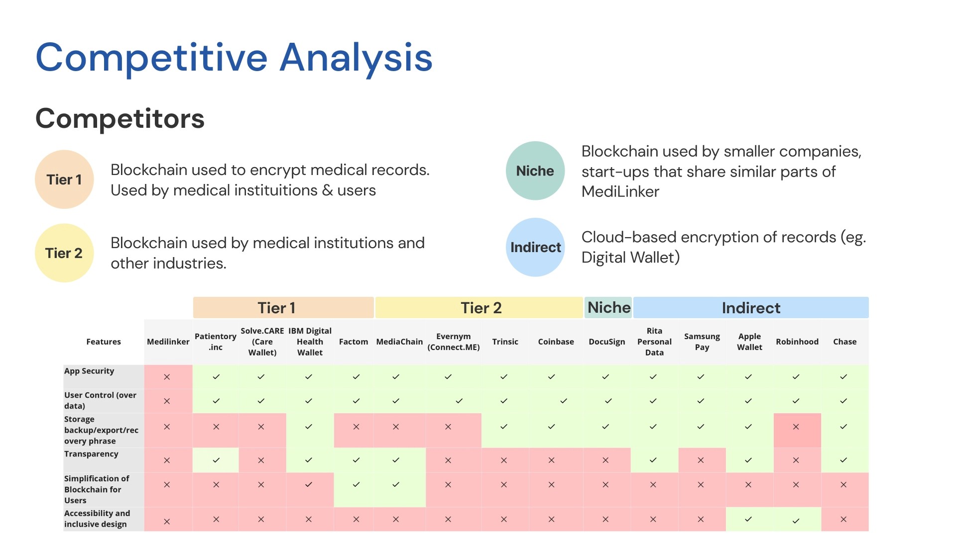
To understand the blockchain+healthcare app market and see how MediLinker could stand out, we conducted Competitive Analysis.
Types of Competitors:
Tier 1: Blockchain used to encrypt medical records. Used by medical institutions & users
Tier 2: Blockchain used by medical institutions and other industries.
Niche: Blockchain used by smaller companies, start-ups that share similar parts of MediLinker
Indirect: Cloud-based encryption of records (eg. Digital Wallet)
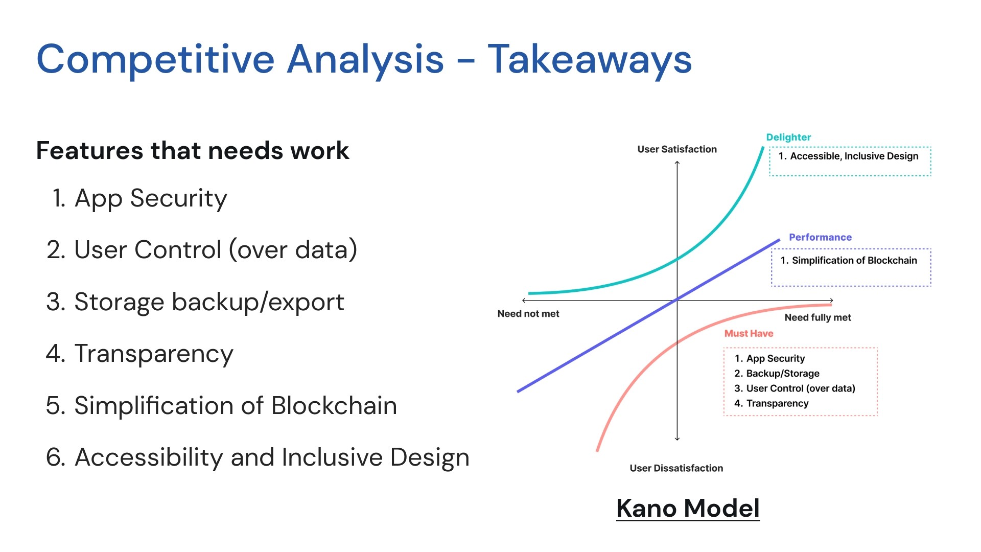
Some features needed some work for MediLinker to stand with the competitors, while also setting them apart. Using Kano Model, we categorized these features as must-haves, performances and delighters.
Some features needed some work for MediLinker to stand with the competitors, while also setting them apart. Using Kano Model, we categorized these features as must-haves, performances and delighters.
Some features needed some work for MediLinker to stand with the competitors, while also setting them apart. Using Kano Model, we categorized these features as must-haves, performances and delighters.
Some features needed some work for MediLinker to stand with the competitors, while also setting them apart. Using Kano Model, we categorized these features as must-haves, performances and delighters.
Solution space (V.1)
To understand the overall space of MediLinker, we needed to first understand MediLinker, while also considering what their competitors are doing.
Solution space (V.1)
To understand the overall space of MediLinker, we needed to first understand MediLinker, while also considering what their competitors are doing.
Solution space (V.1)
To understand the overall space of MediLinker, we needed to first understand MediLinker, while also considering what their competitors are doing.
Solution space (V.1)
To understand the overall space of MediLinker, we needed to first understand MediLinker, while also considering what their competitors are doing.
Understanding the current design
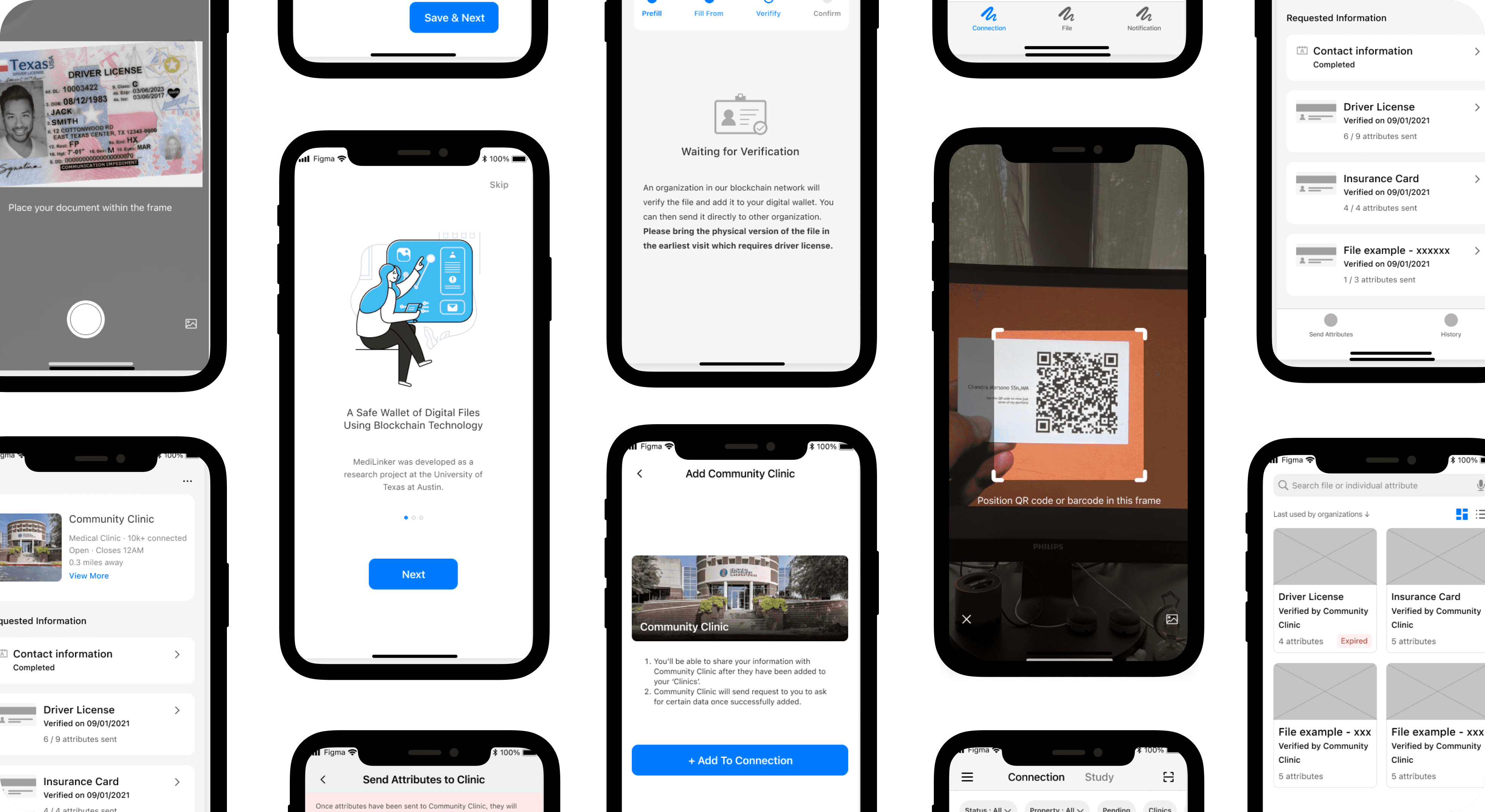
The app flow is designed as follows:
The user goes through general onboarding and provide some personal information
To request to add a clinic, they have to scan a QR code at the clinic
After the request has been approved by the clinic, they have to upload digitized health files to share with the clinic.
They can also select and share specific health information to the clinic.
The app also included browsing & updating files and disconnecting clinics.
To understand and identify possible growth opportunities, the team conducted heuristic evaluation. Using Jakob Nielsen's 10 Heuristics and a severity level from 1-4, as evaluators, we identified problems from low to critical priority in order to allocate resources, time and effort to address it.
Redesign
Based on the information from the heuristic evaluation, competitive analysis and Kano model, we communicated the findings to the Dell Med design team for the next iteration. * The entire design is not shown
Redesign
Based on the information from the heuristic evaluation, competitive analysis and Kano model, we communicated the findings to the Dell Med design team for the next iteration. * The entire design is not shown
Redesign
Based on the information from the heuristic evaluation, competitive analysis and Kano model, we communicated the findings to the Dell Med design team for the next iteration. * The entire design is not shown
Redesign
Based on the information from the heuristic evaluation, competitive analysis and Kano model, we communicated the findings to the Dell Med design team for the next iteration. * The entire design is not shown
Usability Testing
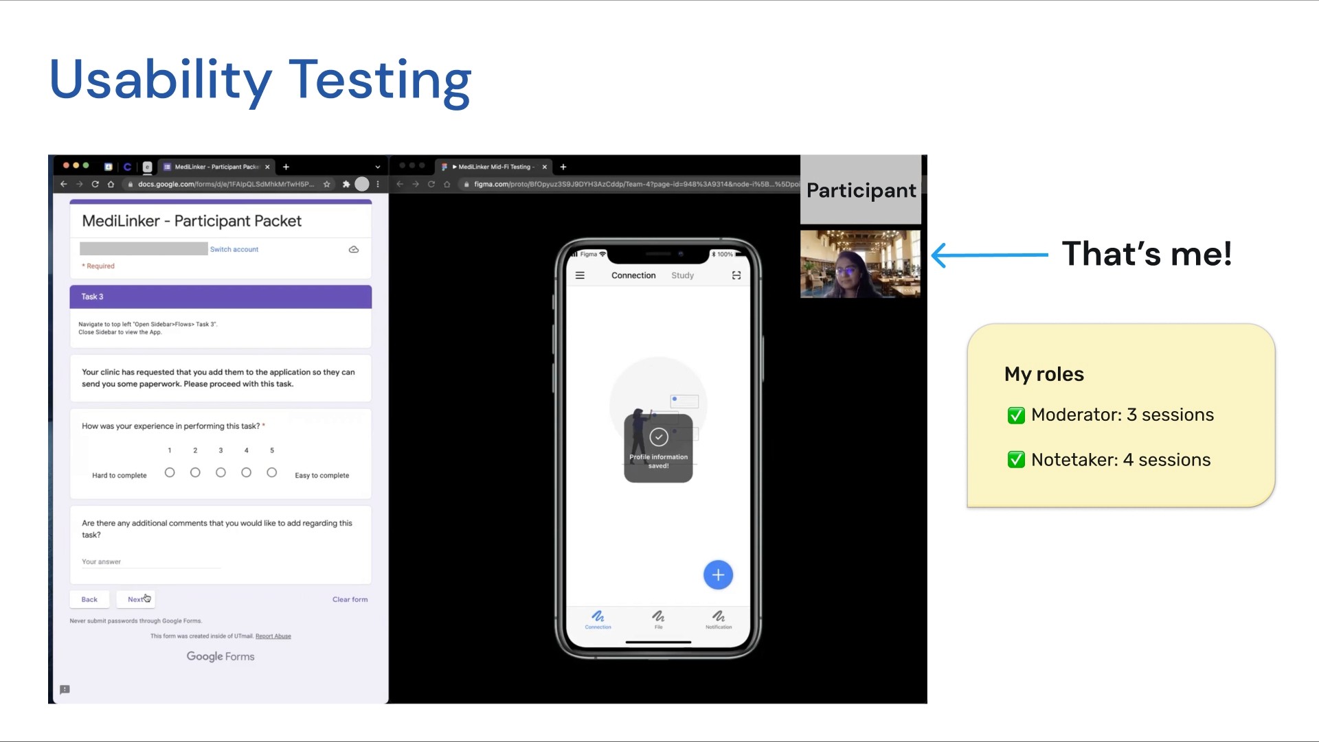
Usability testing was conducted for the redesign through 8 one-hour moderated sessions over Zoom. I participated as both a moderator and notetaker for different sessions. The participants walked through the app (with 7 tasks) while thinking aloud. Due to changes in testing modality and COVID-19, we were only able to recruit participants within 20-30 age range.
Gathering feedback
We collected user feedback through the think-aloud process, follow-up questions and post-test SUS questionnaire. The overall average SUS the was calculated based on 8 participants feedback, was 73. While a SUS score of 68 is typically deemed as average usability, although the design could be usable, there were some growth opportunities.
Insights
Some insights we gathered included:
Even though an email is not part of the app design itself, it is important that it is straightforward as it is the first step of the entire flow.
Overall, there were some confusion regarding the overall purpose of the app. Therefore, the redesign needs to consider establishing this purpose clearly in the onboarding.
Participants felt that the design was missing some information that they expected to see based on their general knowledge of apps. This seems to reflect the issue of the "Match between the system and real world" heuristic. The redesign needs to ensure that it follows some conventions to ensure easier usage.
There was some confusion as to how blockchain was actually integrated with the app.
Participants found the "Action" feedback information to be unclear and lacking. The redesign needs to ensure that the feedback communicates and reassures the users of their actions.
The slides below show a small glimpse into our analysis.
Growth opportunities
We provided a detailed report that covers each task with user feedback, growth opportunities and recommendations. An example is shown below.
Growth opportunities
We provided a detailed report that covers each task with user feedback, growth opportunities and recommendations. An example is shown below.
Growth opportunities
We provided a detailed report that covers each task with user feedback, growth opportunities and recommendations. An example is shown below.
Growth opportunities
We provided a detailed report that covers each task with user feedback, growth opportunities and recommendations. An example is shown below.
We tied the usability test findings back to the Kano model to communicate the next steps to the client. We also summarized the next steps for the redesign through an effort vs. impact diagram. This is shown in the slides below.
We tied the usability test findings back to the Kano model to communicate the next steps to the client. We also summarized the next steps for the redesign through an effort vs. impact diagram. This is shown in the slides below.
We tied the usability test findings back to the Kano model to communicate the next steps to the client. We also summarized the next steps for the redesign through an effort vs. impact diagram. This is shown in the slides below.
We tied the usability test findings back to the Kano model to communicate the next steps to the client. We also summarized the next steps for the redesign through an effort vs. impact diagram. This is shown in the slides below.
Conclusion
Conclusion
Conclusion
Conclusion
Lessons learned
The importance of covering all aspects, even outside the app design: We received positive feedback from the client, design and blockchain team for considering all perspectives. The client especially appreciated that we even considered the email design as part of the experience to help provide recommendations for it.
The importance of having backup plans and pilot tests to identify possible problem areas that participants may run into: Knowing these details beforehand can help the moderators navigate the participants around a bug in the system and keep the session rolling.
Retrospect
Ideally, we would have worked with the Dev team to estimate the level of effort for improving features for the next redesign and included their input into the effort vs. impact diagram. Since we did not have access to the Dev team, we were not able to do this.
Retrospect
Ideally, we would have worked with the Dev team to estimate the level of effort for improving features for the next redesign and included their input into the effort vs. impact diagram. Since we did not have access to the Dev team, we were not able to do this.
Retrospect
Ideally, we would have worked with the Dev team to estimate the level of effort for improving features for the next redesign and included their input into the effort vs. impact diagram. Since we did not have access to the Dev team, we were not able to do this.
Retrospect
Ideally, we would have worked with the Dev team to estimate the level of effort for improving features for the next redesign and included their input into the effort vs. impact diagram. Since we did not have access to the Dev team, we were not able to do this.


