A11Y: Function of Beauty
A11Y: Function of Beauty
Through a 2-week Rapid Prototyping project, my team and I conducted an accessibility audit on the custom beauty brand Function of Beauty to identify accessibility issues based on WCAG 2.1 criteria and provide design recommendations.
Through a 2-week Rapid Prototyping project, my team and I conducted an accessibility audit on the custom beauty brand Function of Beauty to identify accessibility issues based on WCAG 2.1 criteria and provide design recommendations.
Project Context
Timeline: Oct - Nov 2022
(2 week project)
Responsibilities
Tools
Figma
WCAG 2.1
ANDI plugin
WAVE plugin
Project Context
Timeline: Oct - Nov 2022 (2 week project)
Timeline: Oct - Nov 2022 (2 week project)
Timeline: Oct - Nov 2022 (2 week project)
Responsibilities
UX Researcher & Designer
A11y evaluator
UX Researcher & Designer
A11y evaluator
Tools
Figma
WCAG 2.1
ANDI plugin
WAVE plugin
Figma
WCAG 2.1
ANDI plugin
WAVE plugin
About WCAG
The Web Content Accessibility Guidelines (WCAG) framework is considered to be the international standard for digital accessibility [1].
About WCAG
The Web Content Accessibility Guidelines (WCAG) framework is considered to be the international standard for digital accessibility [1].
About WCAG
The Web Content Accessibility Guidelines (WCAG) framework is considered to be the international standard for digital accessibility [1].
About WCAG
The Web Content Accessibility Guidelines (WCAG) framework is considered to be the international standard for digital accessibility [1].
WCAG 2.1
WCAG 2.1 was initiated with the goal to improve accessibility guidance for three major groups: users with cognitive or learning disabilities, users with low vision, and users with disabilities on mobile devices. Developed through the W3C process in cooperation with individuals and organizations around the world, WCAG 2.1 aims to be the shared standard for Web content accessibility that meets the needs of individuals, organizations, and governments internationally [2].
Accessibility Audit
A web accessibility audit identifies accessibilities violations and issues that prevents persons with disabilities from using the web. The audit establishes whether the website is accessible for persons with disabilities [3, 4].
An audit acts as a prescription and not a complete solution. As web content gets updated and web standards change over time, A11Y advocates must consistently keep up and ensure if it is accessible. Therefore, those involved in the creation of web content: designers, developers, website owners, needs to make accessibility as a consistent priority and ensure it meets the universal A11Y standards. To ensure it is always prioritized, accessibility must be considered throughout the process of research, design, content creation and development.
WCAG + Visual Aspects
It is estimated that around 53.2 million Americans aged 45 or older have some form of visual impairment, from mild to severe, and about 18 percent of those affected are “legally blind" [5].Visual impairments span a range of issues and disabilities, the most prominent of which are color blindness, low vision, and blindness [6]. It is also estimated that about 285 million people are visually impaired worldwide: 39 million are blind and 246 million have low vision. According to WHO, vision impairment poses an enormous global financial burden with the annual global costs of productivity losses associated with vision impairment estimated to be US$ 411 billion[7].
To ensure inclusivity, it is important to ensure that the design is inclusive and accessible to the needs of all users - including target users, users outside of your target demographic, users with disabilities, and even users from different cultures and countries[8].
About the Audit
About the Audit
About the Audit
About the Audit
Scope
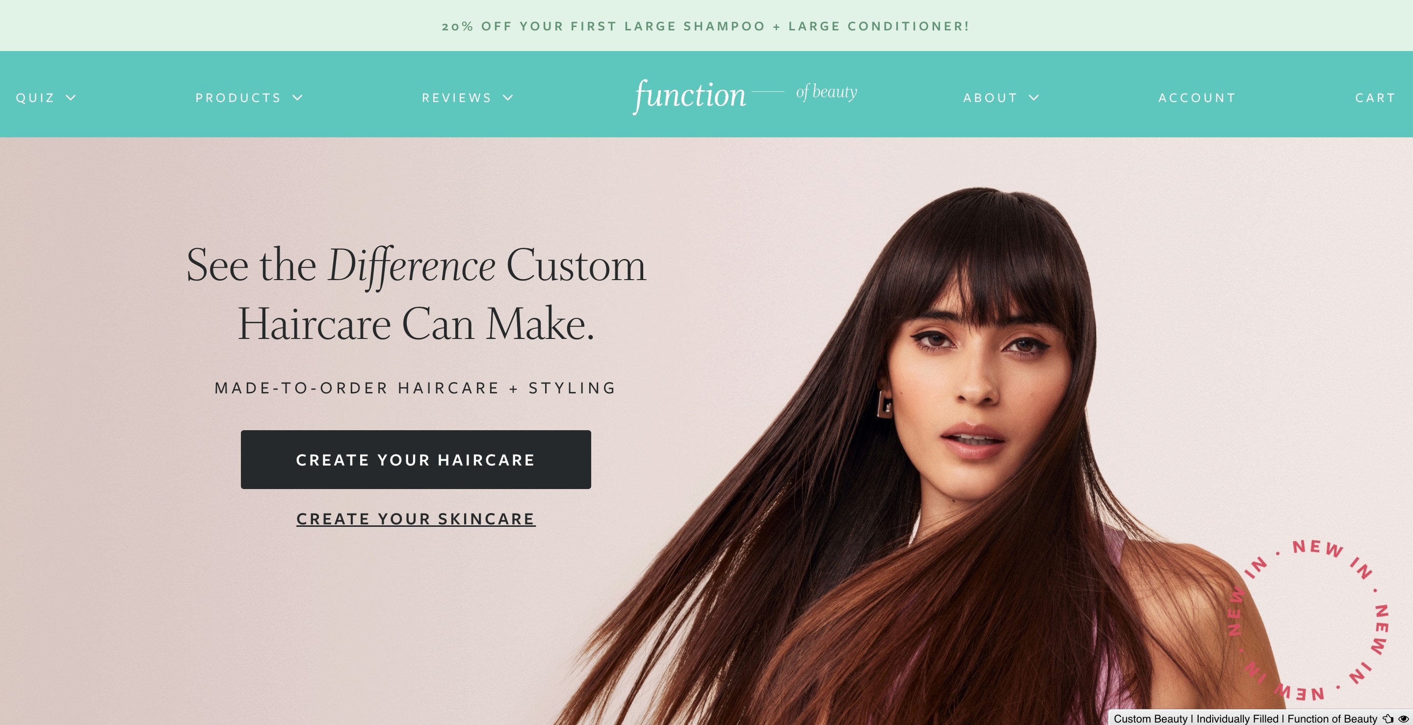
This audit will evaluate the custom beauty brand: Function of Beauty. Since this was a 2-week class project, the scope was limited to finding 3 WCAG issues on 3 pages each. The scope was also limited to focusing on visual aspects with accessibility in mind: color, typography, layout- and if appropriate animation, navigation.
Focus
The A11Y audit on Function of Beauty focused on 3 pages:
These pages were selected as this is the initial flow a new user may go through when visiting the site for the first time. Since this is a custom beauty brand, the user has to take a quiz to find products that match their needs.
Focus
The A11Y audit on Function of Beauty focused on 3 pages:
These pages were selected as this is the initial flow a new user may go through when visiting the site for the first time. Since this is a custom beauty brand, the user has to take a quiz to find products that match their needs.
Focus
The A11Y audit on Function of Beauty focused on 3 pages:
These pages were selected as this is the initial flow a new user may go through when visiting the site for the first time. Since this is a custom beauty brand, the user has to take a quiz to find products that match their needs.
Focus
The A11Y audit on Function of Beauty focused on 3 pages:
These pages were selected as this is the initial flow a new user may go through when visiting the site for the first time. Since this is a custom beauty brand, the user has to take a quiz to find products that match their needs.
Goal
The team focused on:
identifying A11Y issues that existed in the pages in review
provide solutions and justifications
Since the scope of this audit was evaluating the visual aspects, we focused on addressing the following visible impairments and disabilities:
Blindness: Attributed to complete or near-complete vision loss.
Blurred vision: Causes both near and far to appear to be out of focus, despite conventional spectacle correction possible.
Temporary vision impairment: Causes includes eye surgery (eg: lasik), episodic blindness (temporary of vision in 1 eye ranging from seconds to minutes)
Situational limitations: These include situations that may affect experience while navigating the website such as sunlight blinding the screen etc.
Evaluation Summary
Evaluation Summary
Evaluation Summary
Evaluation Summary
A11Y Issues
Color contrast
Color & contrast are important in accessibility since users (including users with visual disabilities) must able to perceive content on a webpage[1].
Alt Text
Alternative (alt) text describes the appearance or function of an image on a page [1] and is primarily used by people who use screen readers to access websites, apps etc [1].
Miscellaneous
This includes problems that affect the overall experience while navigating such as navigation, animation etc.
WCAG 2.1 Criteria
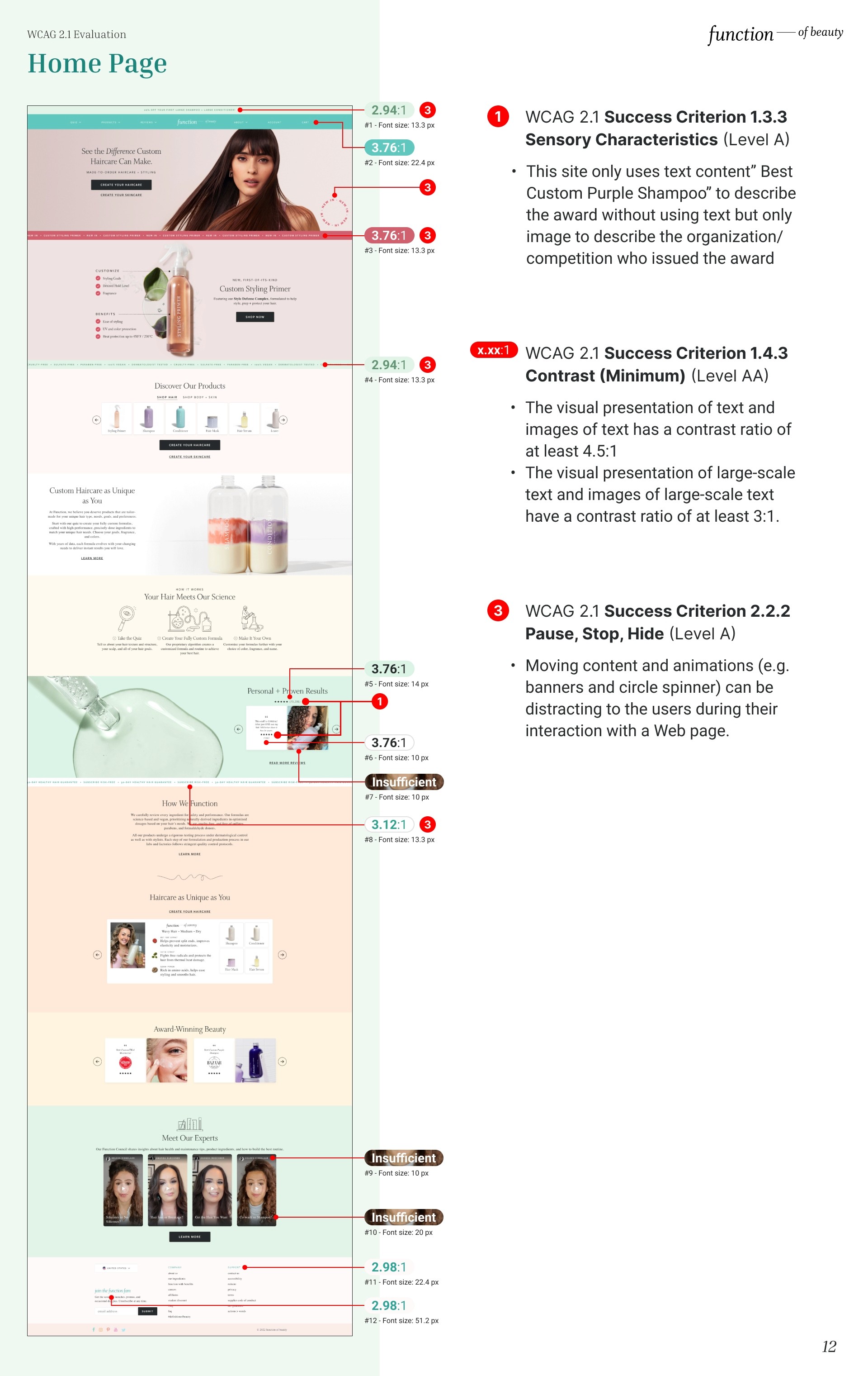
The following is the list of WCAG 2.1 issues identified (in no particular order):
1.4.3 Contrast (Minimum)
1.1.1 Non-Text Content
1.3.3 Sensory Characteristics
2.2.2 Pause, Stop, Hide
1.3.5 Identify Input Purpose
1.4.4 Resize Text
2.1.1 Keyboard
1.3.2 Meaningful Sequence
1.4.1 Use of Color
Homepage evaluation
Homepage evaluation
Homepage evaluation
Homepage evaluation
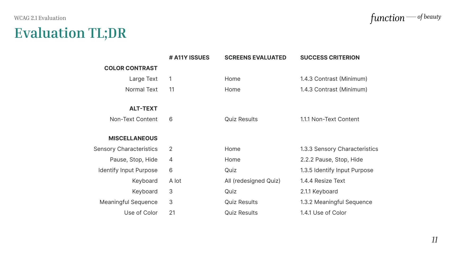
Sensory Characteristics
This site only uses text content" Best Custom Purple Shampoo" to describe the award without using text but only image to describe the organization/ competition who issued the award. Therefore it fails to satisfy the WCAG 2.1 Success Criterion 1.3.3 Sensory Characteristics (Level A).
Contrast (Minimum)
The visual presentation fails to satisfy the WCAG 2.1 Success Criterion 1.4.3 Contrast (Minimum) (Level AA).
According to 1.4.3:
The visual presentation of text and images of text has a contrast ratio of at least 4.5:1.
The visual presentation of large-scale text and images of large-scale text have a contrast ratio of at least 3:1.
Pause, Stop, Hide
Moving content and animations (e.g. banners and circle spinner) can be distracting to the users during their interaction with a Web page.
Pause, Stop, Hide
Moving content and animations (e.g. banners and circle spinner) can be distracting to the users during their interaction with a Web page.
Pause, Stop, Hide
Moving content and animations (e.g. banners and circle spinner) can be distracting to the users during their interaction with a Web page.
Pause, Stop, Hide
Moving content and animations (e.g. banners and circle spinner) can be distracting to the users during their interaction with a Web page.
Quiz page evaluation
Quiz page evaluation
Quiz page evaluation
Quiz page evaluation
Identify Input Purpose
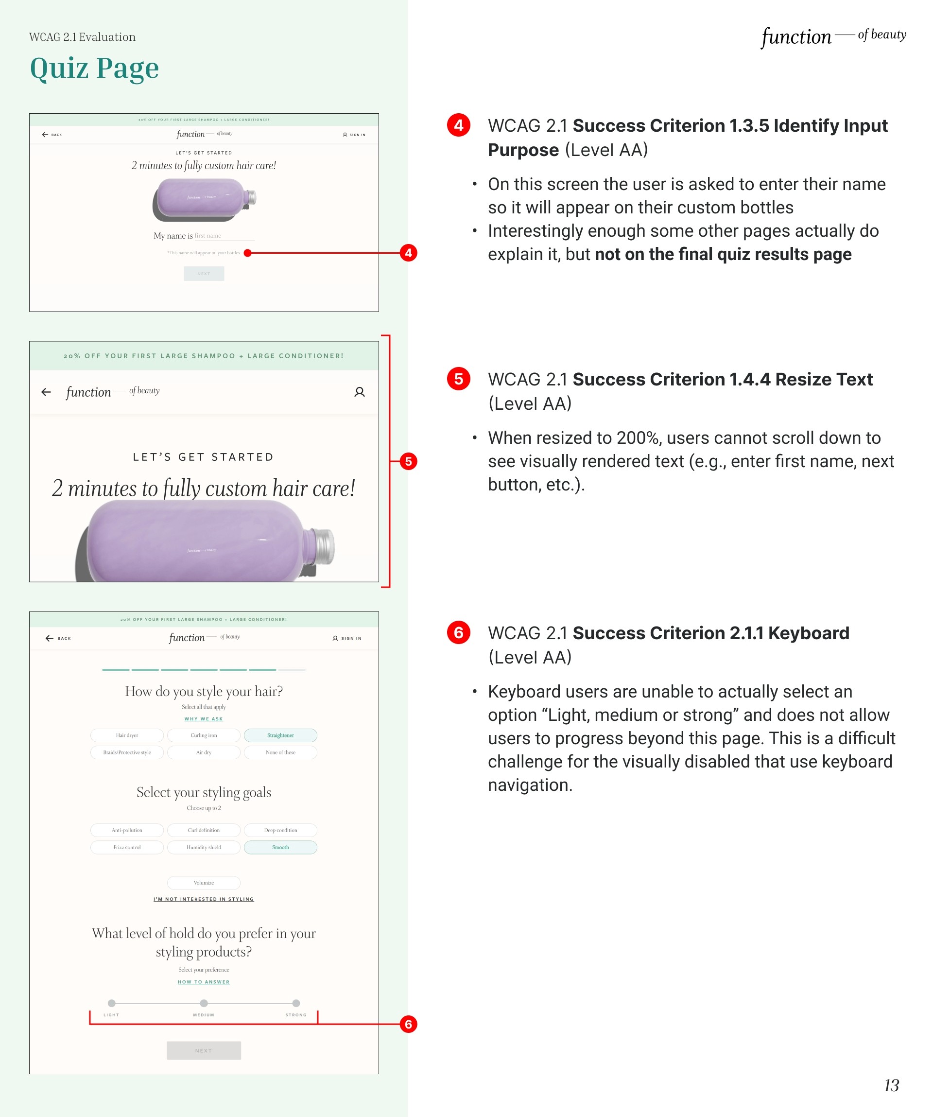
On this screen the user is asked to enter their name so it will appear on their custom bottles. Interestingly enough some other pages actually do explain it, but not on the final quiz results page. Therefore, it fails to satisfy the WCAG 2.1 Success Criterion 1.3.5 Identify Input Purpose (Level AA).
Resize Text
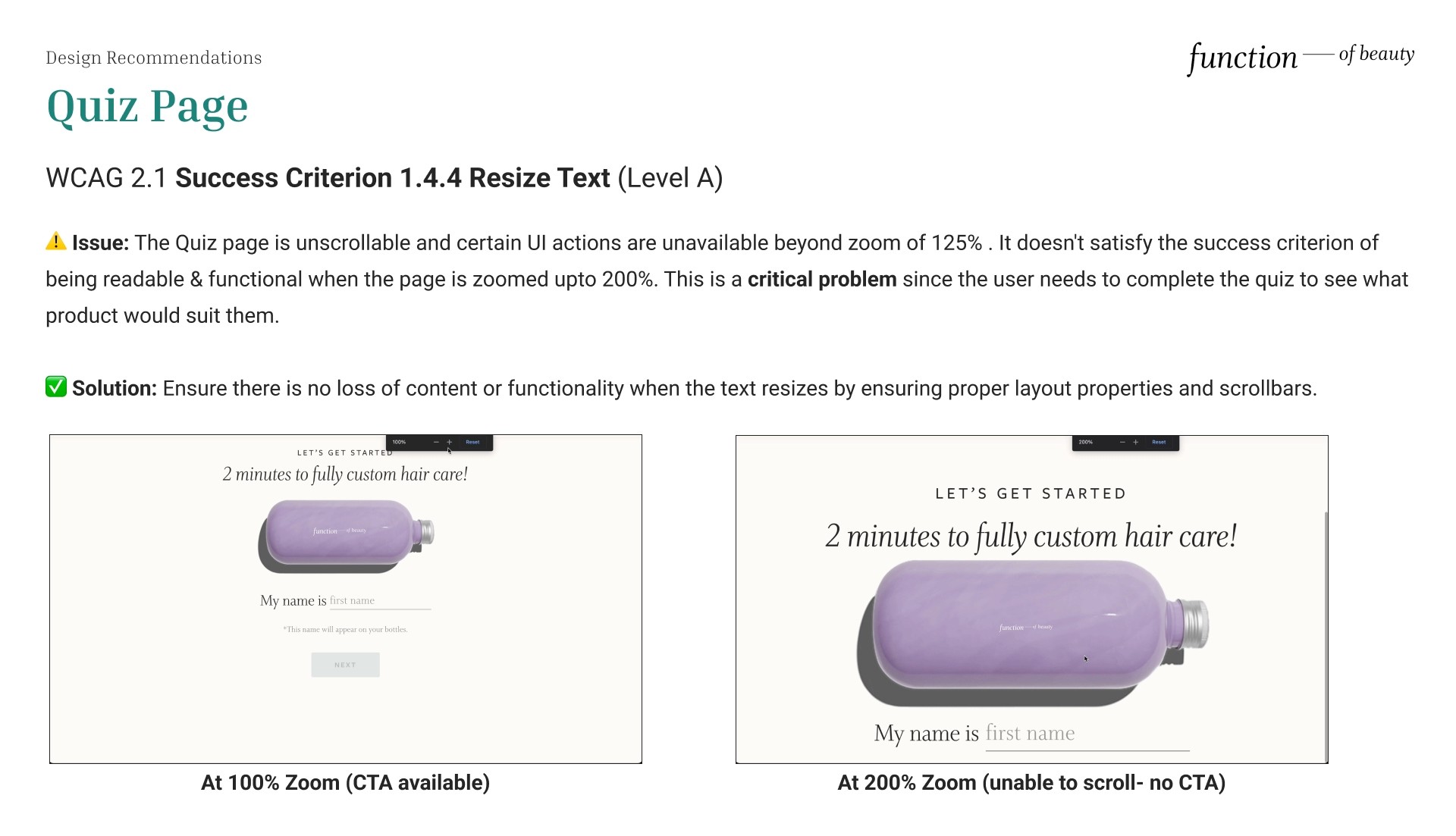
When resized to 200%, users cannot scroll down to see visually rendered text (e.g., enter first name, next button, etc.). Therefore it fails the WCAG 2.1 Success Criterion 1.4.4 Resize Text (Level AA).
Resize Text
When resized to 200%, users cannot scroll down to see visually rendered text (e.g., enter first name, next button, etc.). Therefore it fails the WCAG 2.1 Success Criterion 1.4.4 Resize Text (Level AA).
Resize Text
When resized to 200%, users cannot scroll down to see visually rendered text (e.g., enter first name, next button, etc.). Therefore it fails the WCAG 2.1 Success Criterion 1.4.4 Resize Text (Level AA).
Resize Text
When resized to 200%, users cannot scroll down to see visually rendered text (e.g., enter first name, next button, etc.). Therefore it fails the WCAG 2.1 Success Criterion 1.4.4 Resize Text (Level AA).
Keyboard
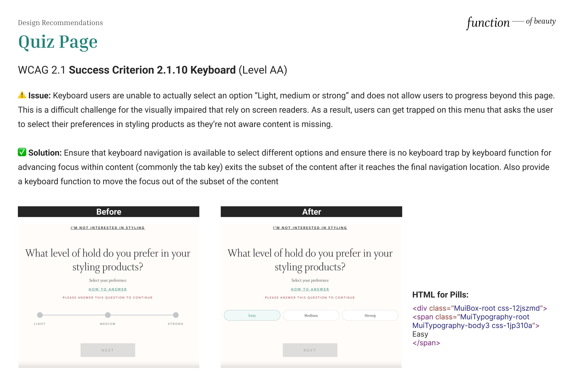
Keyboard users are unable to actually select an option “Light, medium or strong” and does not allow users to progress beyond this page. This is a difficult challenge for the visually disabled that use keyboard navigation. Therefore it fails the WCAG 2.1 Success Criterion 2.1.1 Keyboard (Level AA).
Results page evaluation
Results page evaluation
Results page evaluation
Results page evaluation
Non-Text Content
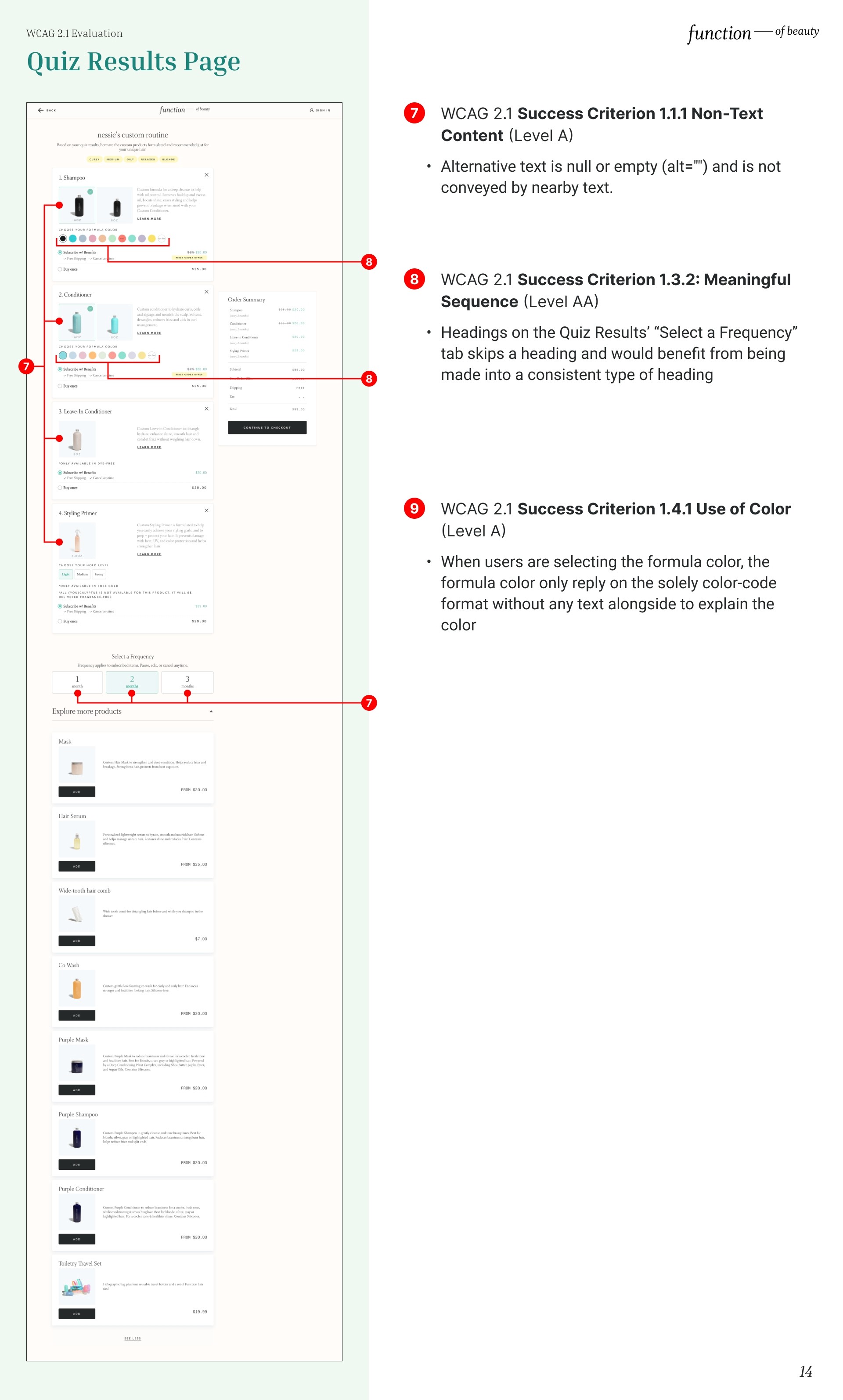
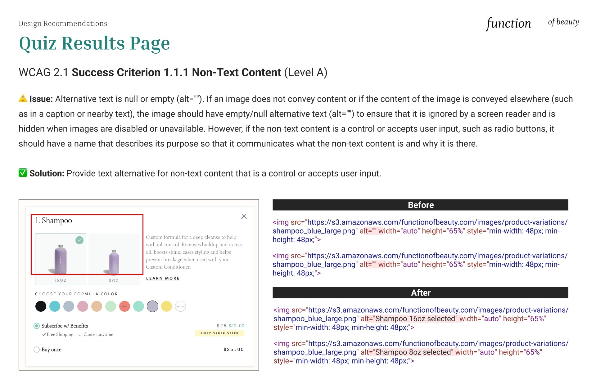
Alternative text is null or empty (alt="") and is not conveyed by the nearby text. Non-text content does not communicate its purpose. Therefore, it fails WCAG 2.1 Success Criterion 1.1.1 Non-Text Content (Level A).
Non-Text Content
Alternative text is null or empty (alt="") and is not conveyed by the nearby text. Non-text content does not communicate its purpose. Therefore, it fails WCAG 2.1 Success Criterion 1.1.1 Non-Text Content (Level A).
Non-Text Content
Alternative text is null or empty (alt="") and is not conveyed by the nearby text. Non-text content does not communicate its purpose. Therefore, it fails WCAG 2.1 Success Criterion 1.1.1 Non-Text Content (Level A).
Non-Text Content
Alternative text is null or empty (alt="") and is not conveyed by the nearby text. Non-text content does not communicate its purpose. Therefore, it fails WCAG 2.1 Success Criterion 1.1.1 Non-Text Content (Level A).
Meaningful Sequence
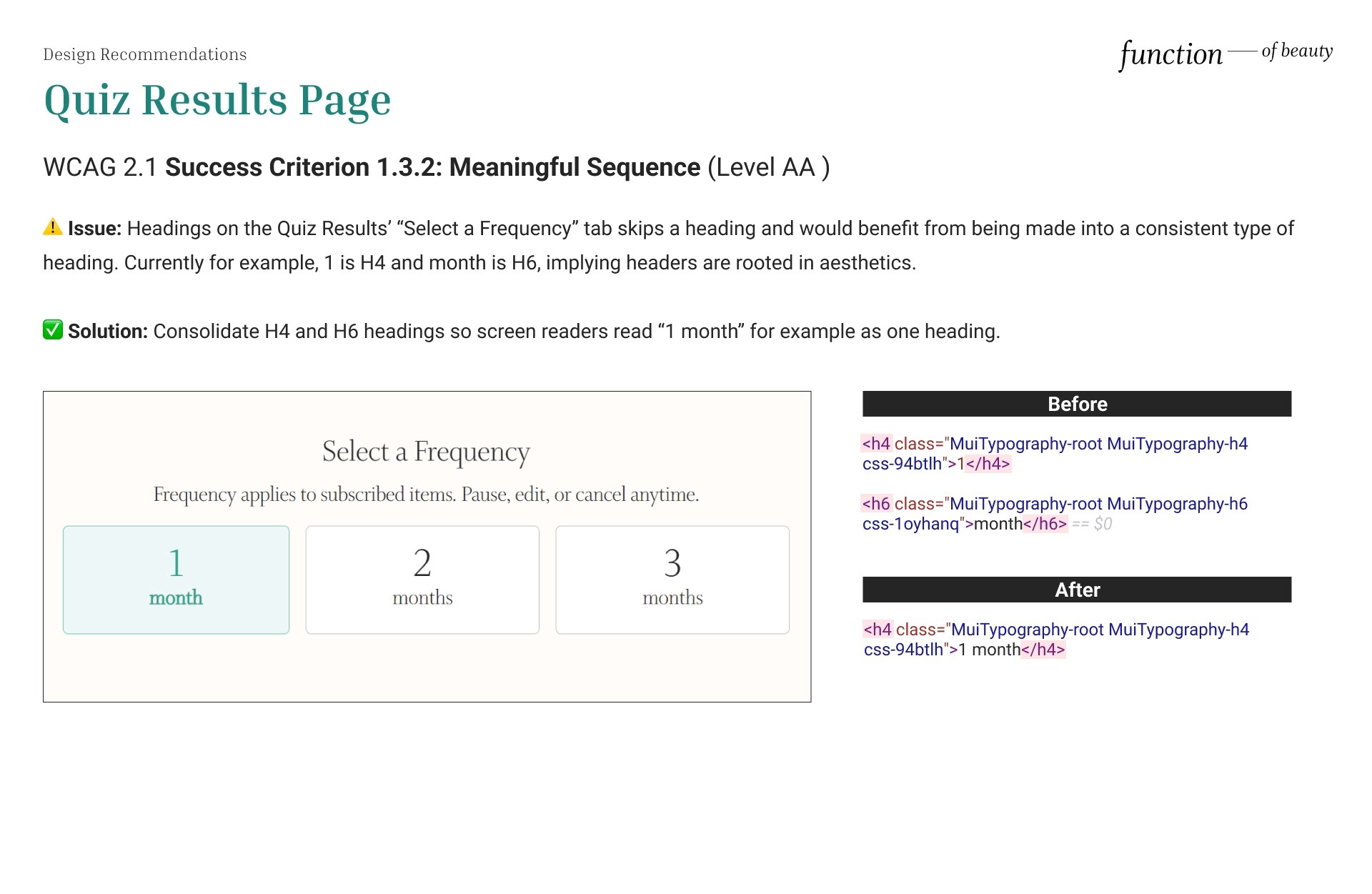
Headings on the Quiz Results’ “Select a Frequency” tab skips a heading and would benefit from being made into a consistent type of heading. Therefore it fails WCAG 2.1 Success Criterion 1.3.2: Meaningful Sequence (Level AA).
Meaningful Sequence
Headings on the Quiz Results’ “Select a Frequency” tab skips a heading and would benefit from being made into a consistent type of heading. Therefore it fails WCAG 2.1 Success Criterion 1.3.2: Meaningful Sequence (Level AA).
Meaningful Sequence
Headings on the Quiz Results’ “Select a Frequency” tab skips a heading and would benefit from being made into a consistent type of heading. Therefore it fails WCAG 2.1 Success Criterion 1.3.2: Meaningful Sequence (Level AA).
Meaningful Sequence
Headings on the Quiz Results’ “Select a Frequency” tab skips a heading and would benefit from being made into a consistent type of heading. Therefore it fails WCAG 2.1 Success Criterion 1.3.2: Meaningful Sequence (Level AA).
Use of Color
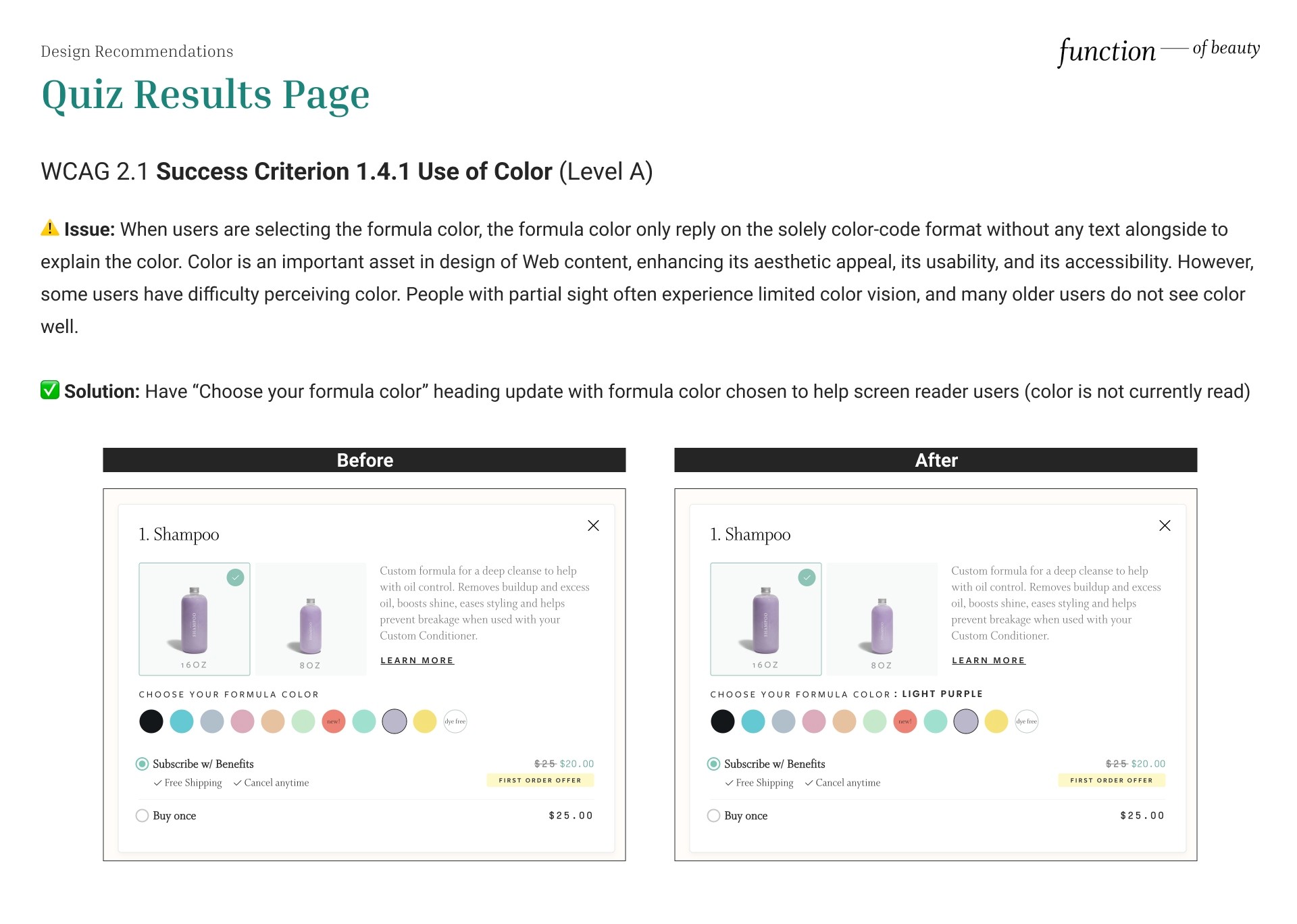
When users are selecting the formula color, the formula color only communicates the color change on the color-code “circle” alone without any text alongside to explain the color. Therefore it fails WCAG 2.1 Success Criterion 1.4.1 Use of Color (Level A).
Use of Color
When users are selecting the formula color, the formula color only communicates the color change on the color-code “circle” alone without any text alongside to explain the color. Therefore it fails WCAG 2.1 Success Criterion 1.4.1 Use of Color (Level A).
Use of Color
When users are selecting the formula color, the formula color only communicates the color change on the color-code “circle” alone without any text alongside to explain the color. Therefore it fails WCAG 2.1 Success Criterion 1.4.1 Use of Color (Level A).
Use of Color
When users are selecting the formula color, the formula color only communicates the color change on the color-code “circle” alone without any text alongside to explain the color. Therefore it fails WCAG 2.1 Success Criterion 1.4.1 Use of Color (Level A).
Overall Recommendations
Overall Recommendations
Overall Recommendations
Overall Recommendations
Color Contrast
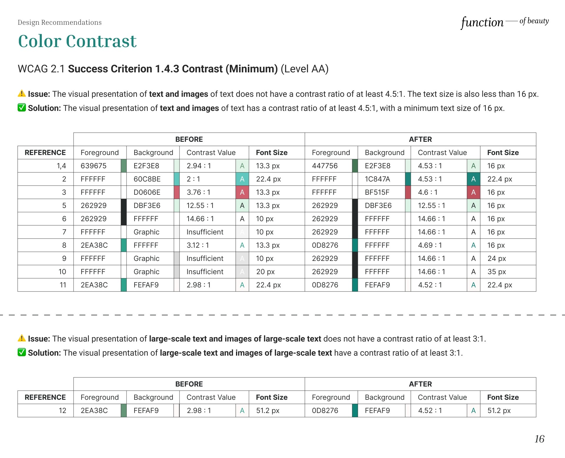
⚠️ Issue: The visual presentation of text and images of text does not have a contrast ratio of at least 4.5:1. The text size is also less than 16 px.
✅ Solution: The visual presentation of text and images of text has a contrast ratio of at least 4.5:1, with a minimum text size of 16 px.
⚠️Issue: The visual presentation of large-scale text and images of large-scale text does not have a contrast ratio of at least 3:1.
✅ Solution: The visual presentation of large-scale text and images of large-scale text have a contrast ratio of at least 3:1.
Non-Text Content
⚠️ Issue: The visual presentation of text and images of text does not have a contrast ratio of at least 4.5:1. The text size is also less than 16 px.
✅ Solution: The visual presentation of text and images of text has a contrast ratio of at least 4.5:1, with a minimum text size of 16 px.
⚠️Issue: The visual presentation of large-scale text and images of large-scale text does not have a contrast ratio of at least 3:1.
✅ Solution: The visual presentation of large-scale text and images of large-scale text have a contrast ratio of at least 3:1.
Homepage Recommendations
Homepage Recommendations
Homepage Recommendations
Homepage Recommendations
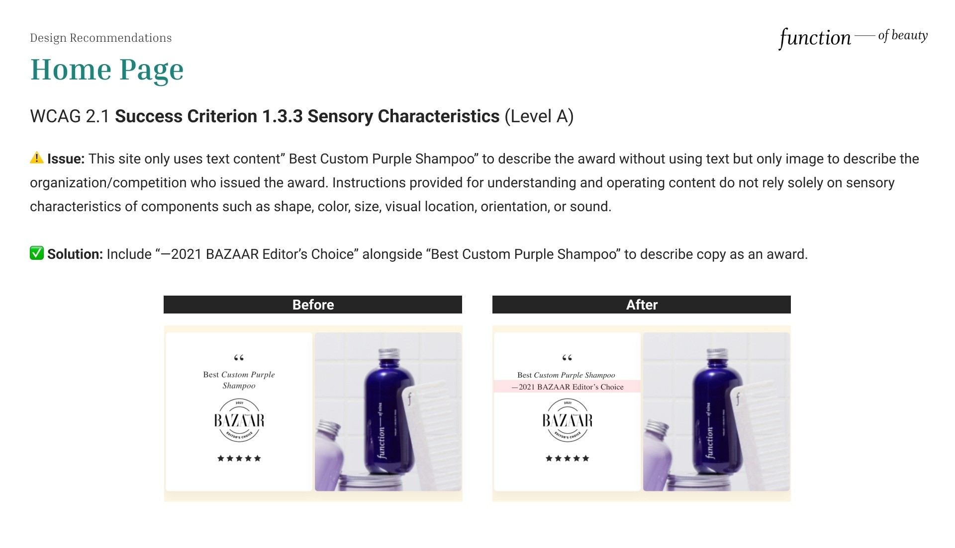
Sensory Characteristics
⚠️ Issue: This site only uses text content” Best Custom Purple Shampoo” to describe the award without using text but only image to describe the organization/competition who issued the award. Instructions provided for understanding and operating content do not rely solely on sensory characteristics of components such as shape, color, size, visual location, orientation, or sound.
✅ Solution: Include “—2021 BAZAAR Editor’s Choice” alongside “Best Custom Purple Shampoo” to describe copy as an award to satisfy WCAG 2.1 Success Criterion 1.3.3 Sensory Characteristics (Level A).
Contrast (Minimum)
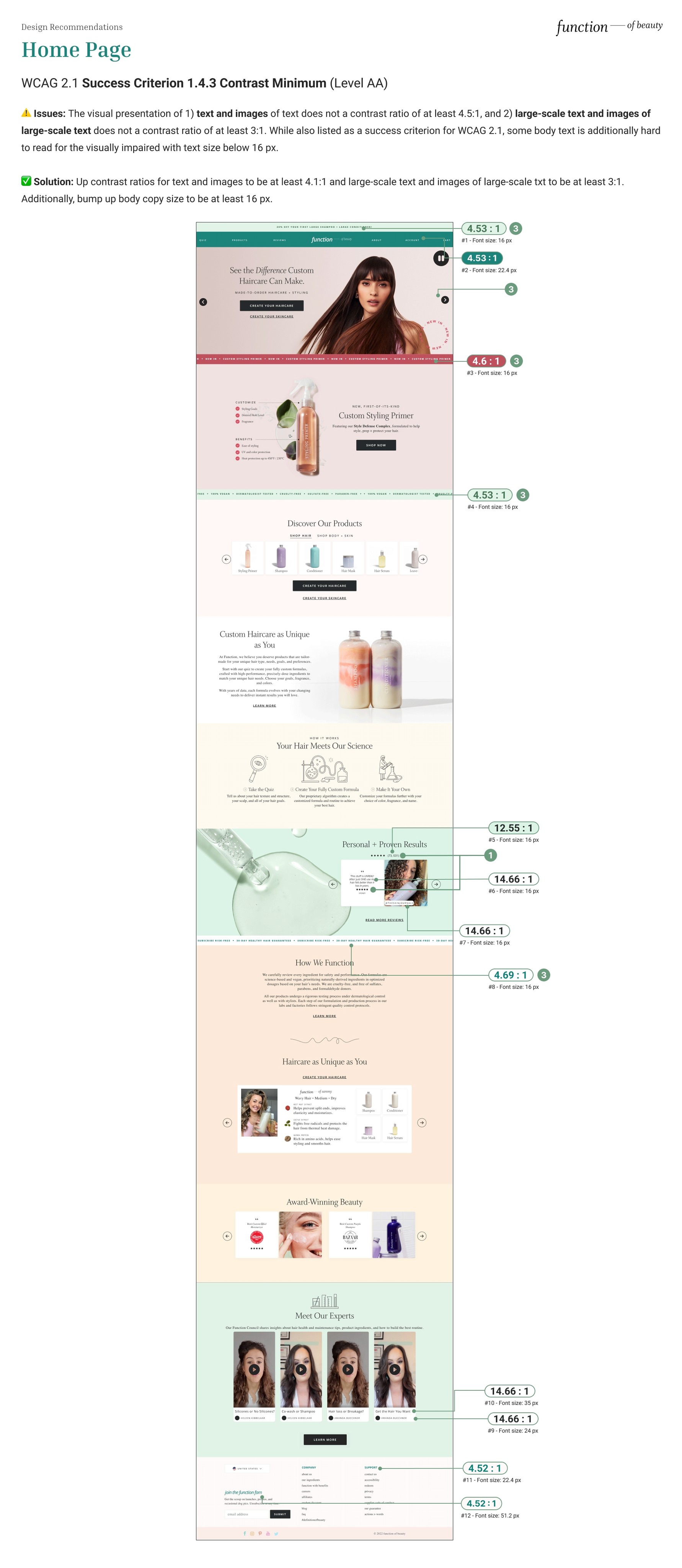
⚠️ Issues: The visual presentation of 1) text and images of text does not a contrast ratio of at least 4.5:1, and 2) large-scale text and images of large-scale text does not a contrast ratio of at least 3:1. While also listed as a success criterion for WCAG 2.1, some body text is additionally hard to read for the visually impaired with text size below 16 px.
✅ Solution: To satisfy WCAG 2.1 Success Criterion 1.4.3 Contrast Minimum (Level AA), increase contrast ratios for text and images to be at least 4.1:1 and large-scale text and images of large-scale txt to be at least 3:1. Additionally, bump up body copy size to be at least 16 px.
Pause, Stop, Hide
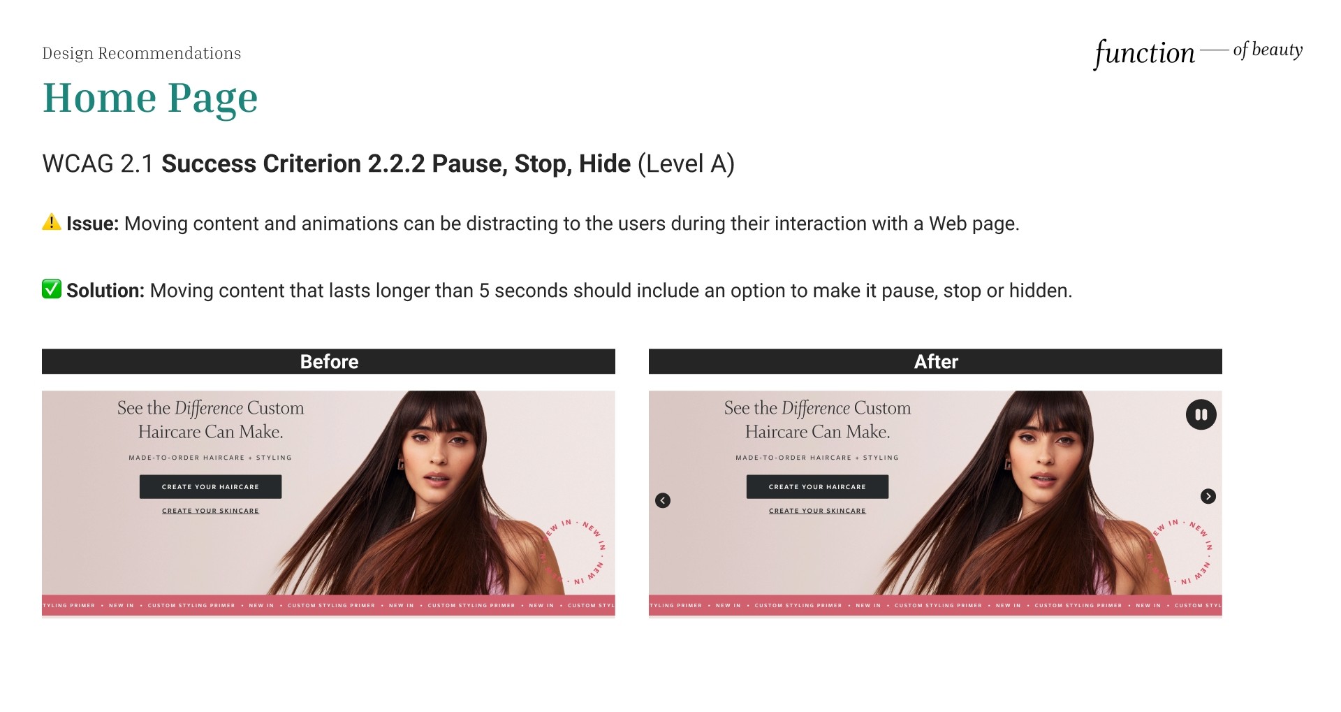
⚠️ Issue: Moving content and animations can be distracting to the users during their interaction with a Web page.
✅ Solution: Moving content that lasts longer than 5 seconds should include an option to make it pause, stop or hidden.
Pause, Stop, Hide
⚠️ Issue: Moving content and animations can be distracting to the users during their interaction with a Web page.
✅ Solution: Moving content that lasts longer than 5 seconds should include an option to make it pause, stop or hidden.
Pause, Stop, Hide
⚠️ Issue: Moving content and animations can be distracting to the users during their interaction with a Web page.
✅ Solution: Moving content that lasts longer than 5 seconds should include an option to make it pause, stop or hidden.
Pause, Stop, Hide
⚠️ Issue: Moving content and animations can be distracting to the users during their interaction with a Web page.
✅ Solution: Moving content that lasts longer than 5 seconds should include an option to make it pause, stop or hidden.
Quiz page Recommendations
Quiz page Recommendations
Quiz page Recommendations
Quiz page Recommendations
Identify Input Purpose
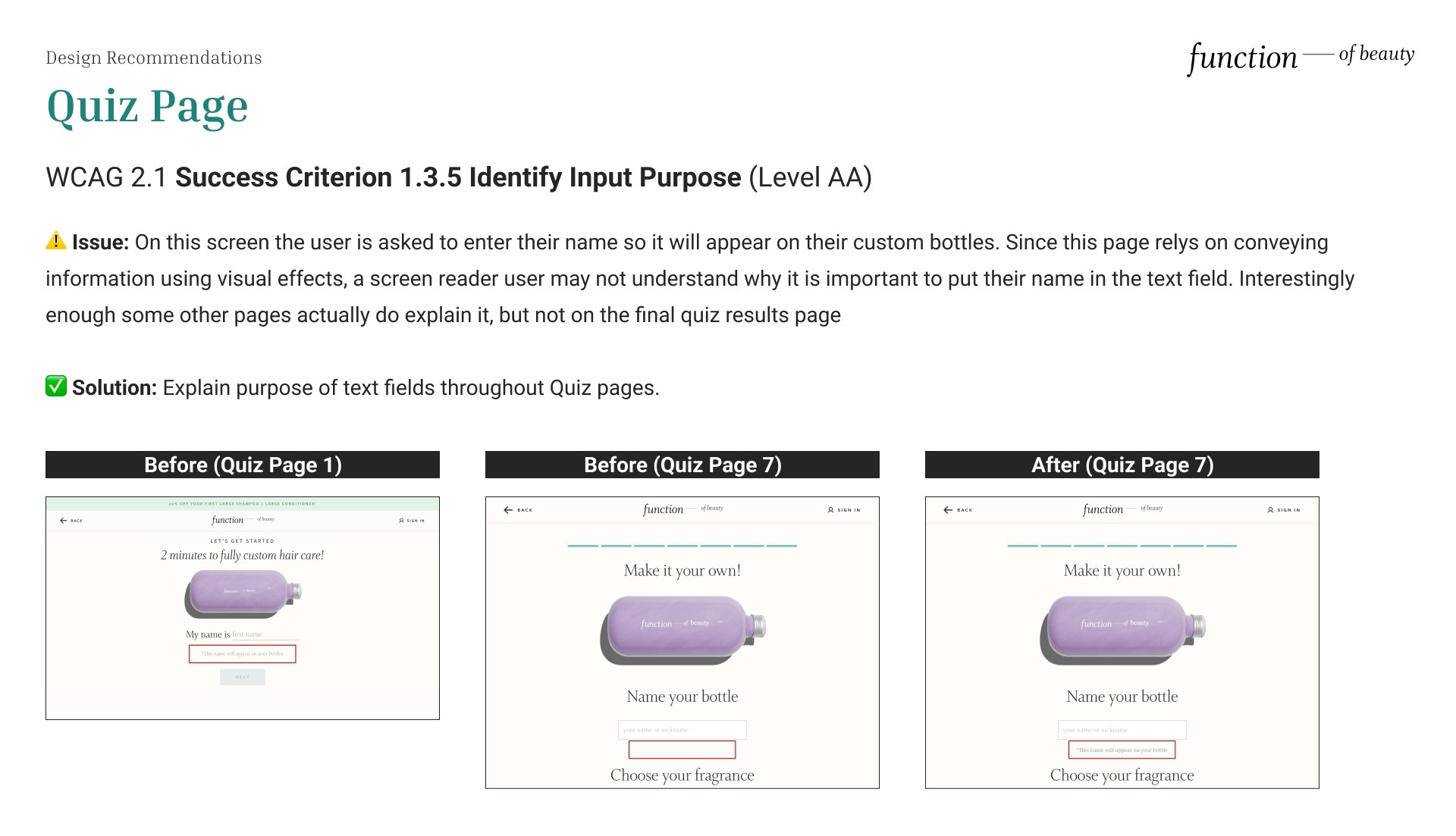
⚠️ Issue: On this screen the user is asked to enter their name so it will appear on their custom bottles. Since this page relies on conveying information using visual effects, a screen reader user may not understand why it is important to put their name in the text field. Interestingly enough some other pages actually do explain it, but not on the final quiz results page
✅ Solution: Explain the purpose of text fields throughout Quiz pages to satisfy WCAG 2.1 Success Criterion 1.3.5 Identify Input Purpose (Level AA).
Resize Text
⚠️ Issue: The Quiz page is not scrollable and certain UI actions are unavailable beyond zoom of 125%. It doesn't satisfy the success criterion of being readable & functional when the page is zoomed up to 200%. This is a critical problem since the user needs to complete the quiz to see what product would suit them.
✅ Solution: Ensure there is no loss of content or functionality when the text resizes by ensuring proper layout properties and scrollbars.
Keyboard
⚠️ Issue: Keyboard users are unable to actually select an option “Light, medium or strong” and does not allow users to progress beyond this page. This is a difficult challenge for the visually impaired that rely on screen readers. As a result, users can get trapped on this menu that asks the user to select their preferences in styling products as they’re not aware content is missing.
✅ Solution: Ensure that keyboard navigation is available to select different options and ensure there is no keyboard trap by keyboard function for advancing focus within content (commonly the tab key) exits the subset of the content after it reaches the final navigation location. Also provide a keyboard function to move the focus out of the subset of the content
Results page Recommendations
Results page Recommendations
Results page Recommendations
Results page Recommendations
Non-Text Content
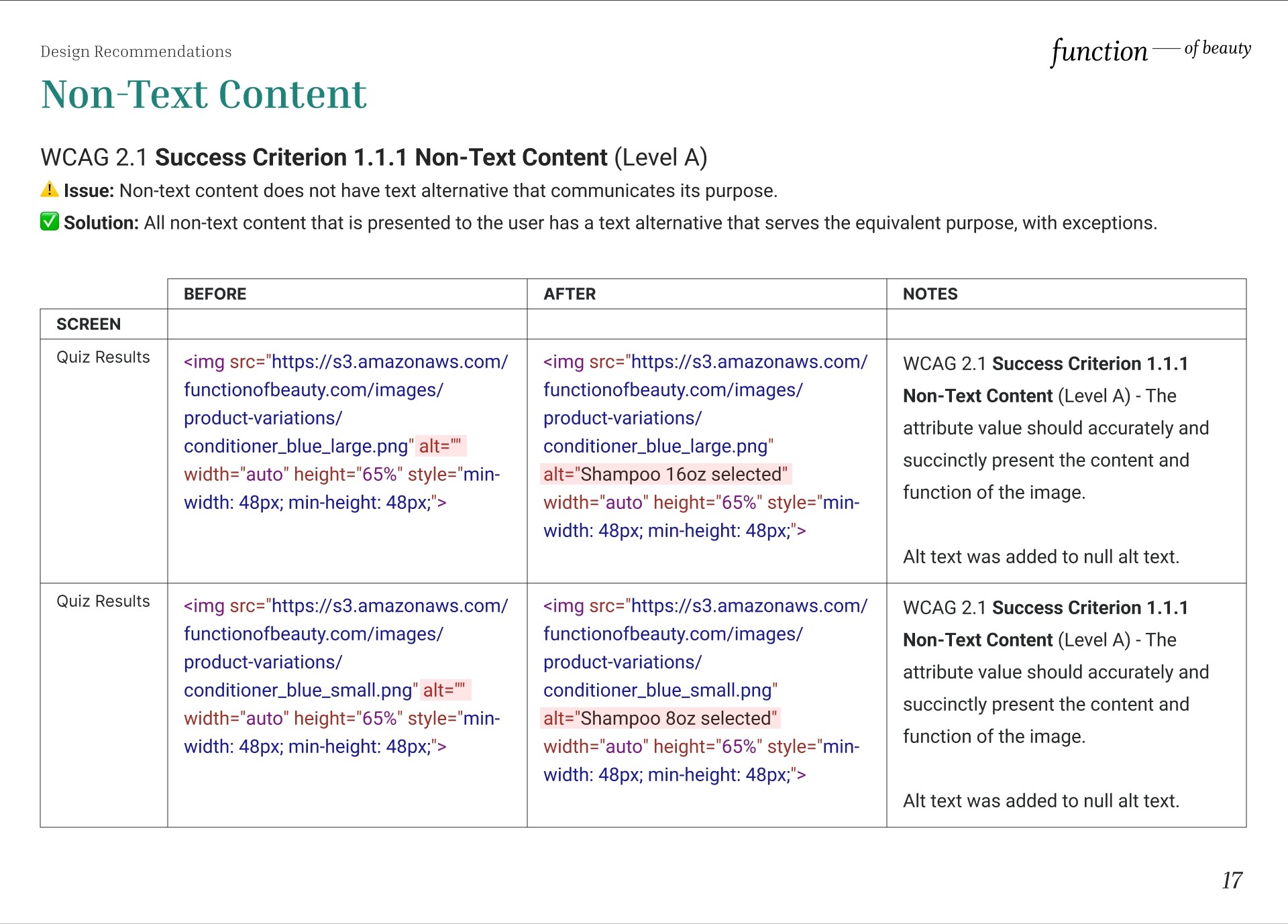
⚠️ Issue: Alternative text is null or empty (alt=""). If an image does not convey content or if the content of the image is conveyed elsewhere (such as in a caption or nearby text), the image should have empty/null alternative text (alt="") to ensure that it is ignored by a screen reader and is hidden when images are disabled or unavailable. However, if the non-text content is a control or accepts user input, such as radio buttons, it should have a name that describes its purpose so that it communicates what the non-text content is and why it is there.
✅ Solution: Provide a text alternative for non-text content that is a control or accepts user input to satisfy WCAG 2.1 Success Criterion 1.1.1 Non-Text Content (Level A).
Meaningful Sequence
⚠️ Issue: Headings on the Quiz Results’ “Select a Frequency” tab skips a heading and would benefit from being made into a consistent type of heading. Currently for example, 1 is H4 and month is H6, implying headers are rooted in aesthetics.
✅ Solution: Consolidate H4 and H6 headings, so screen readers read “1 month” for example, as one heading.
Use of Color
⚠️ Issue: When users are selecting the formula color, the formula color only presents the color as a shape without any text alongside to explain the color. Color is an important asset in the design of Web content, enhancing its aesthetic appeal, usability, and accessibility. However, without appropriate information, some users with vision impairments and disabilities may experience difficulty perceiving color.
✅ Solution: Have the “Choose your formula color” heading include the formula color as a text chosen to help screen reader users. This can help fulfill
Conclusion
Conclusion
Conclusion
Conclusion
Lessons learned
The importance of considering accessibility in the initial stages of design.
How inaccessible design prevents persons with disabilities from experiences that persons without disabilities have access to.
Lessons learned
The importance of considering accessibility in the initial stages of design.
How inaccessible design prevents persons with disabilities from experiences that persons without disabilities have access to.
Lessons learned
The importance of considering accessibility in the initial stages of design.
How inaccessible design prevents persons with disabilities from experiences that persons without disabilities have access to.
Lessons learned
The importance of considering accessibility in the initial stages of design.
How inaccessible design prevents persons with disabilities from experiences that persons without disabilities have access to.
Retrospect
If we had more time, my team was also interested in implementing the changes by replacing the code on the website itself.
In relation to my own portfolio website, accessibility is still a work in progress as I’m currently learning about how it is implemented in Framer and updating it as I learn more.